
Fraktur ligatures live or die on the geometry of the broad pen edge. A ligature is simply two or more letters sharing a stroke, but in Fraktur the letters already lean on each other, and the join has to respect the thick and thin rhythm or the whole word falls apart. Understanding exactly how the nib edge angle produces stroke width gives you control over where those joins sit, which is the difference between a word that reads clearly and one that looks like a black smudge.
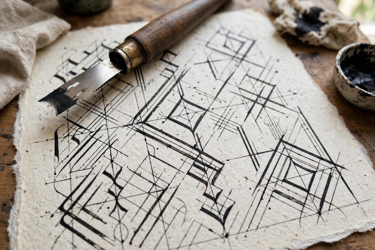
How the nib edge creates stroke width
A broad edge nib is a flat chisel. Hold it so the full width of the edge touches the paper and you get the thickest stroke the nib can make. Draw the edge sideways along its own width and you get a hairline. Every stroke in between gets its width from the angle of travel relative to the edge. Fraktur is traditionally written with the nib held at roughly 30 to 45 degrees to the baseline, which means the downstrokes come out broad and the upstrokes come out thin, with diagonals landing somewhere in the middle.
This matters for ligatures because the joining stroke is almost always a diagonal or a curve, and its weight has to match the letters on either side. If you pull the join at the wrong angle, it thins out and the letters look disconnected, or it fattens up and the counter between them closes. Keep the nib at a consistent angle through the whole join and the weight stays predictable.
The standard Fraktur nib angle and its exceptions
The conventional nib angle for Fraktur sits near 30 degrees, noticeably flatter than the steeper angle used in many round hands. That flatter angle is what gives Fraktur its characteristic sharp, angular look: vertical strokes are thick, and the diagonal strokes that form so many Fraktur letters come out medium weight rather than hairline. When you join letters, resist the urge to rotate the pen at the transition. The temptation is strongest on letters like s and f, where the natural motion of the hand wants to pivot, but pivoting changes the edge geometry mid-stroke and produces a visible kink in the weight.
Building ligatures stroke by stroke
A reliable way to practice is to break each ligature into its letterforms first, then add the joining stroke last. Write the two letters separately at the correct nib angle, leaving a small gap, and study where a connecting stroke would meet each one without breaking the thick and thin pattern. Most Fraktur ligatures (ch, ck, st, the long s combinations) join along the diagonal or at the x-height line, and the connecting stroke is usually an entry or exit stroke extended, not a new stroke invented for the occasion.
Start with st, which is the most forgiving. The s exits at roughly the x-height with a thin diagonal, and the t enters from the same line, so the join is a natural continuation of the existing stroke direction. If the weight of that connecting diagonal looks thinner than the s exit stroke, check your nib angle before you blame your hand. Nine times out of ten the angle drifted during the transition.
Common geometry failures and their causes
A few predictable problems show up in nearly every beginner's ligatures. Closed counters happen when the joining stroke fattens: the join was pulled at an angle too close to perpendicular to the nib edge, producing a near-full-width stroke where a diagonal was needed. Visible kinks mean the nib rotated mid-join, changing the geometry partway through a single stroke. Wobbly joins usually trace back to hesitation, because the hand slows at the transition and nib angle control is hardest at low speed.
There is also the phantom stroke, where the join looks right on its own but the whole letter pair leans in a different direction than the rest of the word. That is a slant problem rather than a geometry problem: the joining stroke pulled the pen away from the established letter slant. Fraktur wants a consistent vertical or slightly forward slant, and the ligature join has to honor it.
Drilling the join without the letters
You do not need full letterforms to train ligature geometry. Set up guide lines and practice nothing but the connecting motions: thin diagonal entries into and out of each letter body, at the fixed nib angle, repeated until the angle holds through the transition. This is where muscle memory for consistent nib angle actually gets built, because removing the letterforms removes the distraction of getting them right.
Work at a larger size than your target writing at first. A nib that is comfortable at large scale will still obey the same geometry at small scale, but errors are easier to see and correct when they are big. Once the joins are consistent large, shrinking down is mostly a matter of keeping the same hand motion with less arm movement.
The payoff for this work is ligatures that hold together as single gestural units instead of two letters glued at the edges. When the edge geometry is right, the joining stroke has the same confidence as the strokes that make up the letters themselves, and the word reads as one continuous piece of writing rather than a collection of parts.
Related Guides
- Pen Angle Geometry for Fractur Script Layouts: Fraktur, the broken blackletter of German printing and manuscript tradition, is built from angular strokes that snap between thick and thin with
- Inter-Letter Kerning Geometry in Batarde Script: Batarde, the French Gothic cursive with its slanted, compressed forms, lives or dies on its rhythm, and rhythm in script is kerning: the space
- Diamond Serif Terminal Widths in Gothic Script: The diamond serif, the small angled foot that terminates the vertical strokes in gothic textura, is one of the script's defining details. Its width