
Fraktur, the broken blackletter of German printing and manuscript tradition, is built from angular strokes that snap between thick and thin with dramatic contrast. That contrast is pure pen angle geometry: the broad nib held at a consistent angle, turned through precise stroke directions, produces every element of the script. Understanding the geometry, which angle, which stroke directions, how they combine into letters and then into page layouts, turns Fraktur from an intimidating thicket of strokes into a logical system.
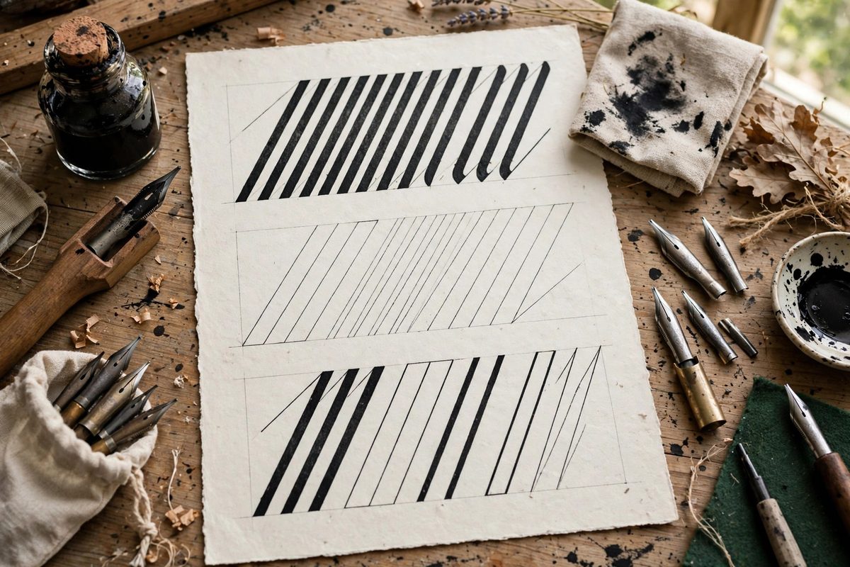
The Fraktur pen angle
Fraktur is traditionally written with the nib at roughly 30 degrees to the baseline, though some hands use slightly steeper angles for more dramatic contrast. At this angle, vertical strokes render near maximum width, giving Fraktur its bold stems, while the characteristic broken curves and angled transitions produce the script's rhythmic thick-thin alternation. The angle must stay constant across the whole piece; Fraktur's dense, angular texture exposes variation ruthlessly. Establish the angle with guide marks and check it the way textura scribes do: stem widths should match throughout. The 30-degree angle also shapes the script's distinctive features: the broken arches, the pointed transitions where curves snap into angles, and the hairline connectors that link strokes. Each of these is a geometric consequence of moving the angled nib through the stroke path; learn the paths and the angle does the rest.
Stroke vocabulary and letter construction
Fraktur letters assemble from a limited set of strokes: the straight stem, the broken arch, the angled connector, the hairline, and the various entry and exit flourishes. Practice these strokes individually until each is clean at the correct angle, because letters are just choreographed sequences of them. Pay special attention to the breaks: Fraktur's defining move is the sharp transition where a curve snaps into an angle, and the crispness of that snap depends on decisive pen movement, not on hesitation. Build letters stroke by stroke in the traditional order, watching the white space inside each letter as carefully as the black strokes; in a dense script, the counters (the white shapes) define legibility as much as the strokes. When a letter looks wrong, diagnose geometrically: which stroke deviated from the angle, and where did the sequence break down.
Capitals and the decorative register
Fraktur capitals are a second script living alongside the minuscules: larger, more flourished, often with elaborate pen-drawn ornament. They follow the same angle geometry but add a freer stroke vocabulary, with sweeping curves and decorative breaks that showcase the calligrapher's skill. In layouts, capitals serve as hierarchy: chapter openings, verse initials, and emphasized words get the decorated treatment while body text stays disciplined. Keep the capitals' angle consistent with the text even as the strokes get fancier; the ornament should feel like Fraktur dressed up, not a different script. Practice capitals as their own alphabet, since their stroke sequences differ substantially from the minuscules.
Page layout and hierarchy
A Fraktur layout organizes the page through size, spacing, and ornament rather than through varied typefaces. Establish a clear hierarchy: large decorated initials or headings, body text in disciplined minuscules, and perhaps a contrasting script or color for rubrics (the red headings of manuscript tradition, still effective today). Keep line spacing generous enough that the dense blackletter does not become an impenetrable wall; Fraktur needs more leading than its x-height suggests, because ascenders and descenders are busy with ornament. Plan margins wide enough to frame the text block handsomely; cramped margins make even beautiful lettering look anxious. Sketch the full layout before writing, allocating space for each element, because Fraktur does not forgive crowding added as an afterthought.
Tools, ink, and practice
Choose a nib width that suits the intended scale, remembering that Fraktur's x-height runs around four to five nib widths. Use a smooth, well-sized paper that supports crisp edges; rough paper frays the fine hairlines that give Fraktur its sparkle. Keep the ink flowing consistently, since starved strokes lose their contrast logic. And study historical models: the great Fraktur writing masters left copybooks that remain the best teachers of the script's geometry. The angle is the constant; everything else in Fraktur is choreography built on it.
Hold the angle steady, learn the stroke vocabulary, build letters geometrically, and lay out the page with clear hierarchy. Fraktur looks like chaos mastered; the mastery is all in the angle.
Related Guides
- Broad Pen Edge Geometry for Fraktur Ligatures: Fraktur ligatures live or die on the geometry of the broad pen edge. A ligature is simply two or more letters sharing a stroke, but in Fraktur the
- Inter-Letter Kerning Geometry in Batarde Script: Batarde, the French Gothic cursive with its slanted, compressed forms, lives or dies on its rhythm, and rhythm in script is kerning: the space
- Diamond Serif Terminal Widths in Gothic Script: The diamond serif, the small angled foot that terminates the vertical strokes in gothic textura, is one of the script's defining details. Its width