
The diamond serif, the small angled foot that terminates the vertical strokes in gothic textura, is one of the script's defining details. Its width relative to the stroke determines whether the letter looks crisp and architectural or blobby and uncertain. Getting the terminal widths consistent is a matter of nib manipulation, not luck.
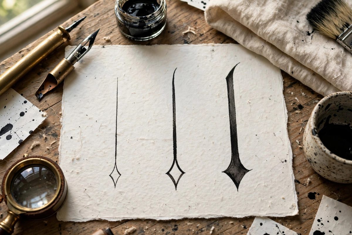
Anatomy of the Diamond Serif
The diamond serif is formed by the flat edge of the broad nib striking the stroke at an angle, creating a small lozenge where the vertical meets the baseline or the waistline. In textura, these serifs appear at the feet of minims and the tops of ascenders, giving the script its characteristic spiky rhythm. The diamond's width should relate clearly to the stroke width: traditionally the serif extends modestly beyond the stroke on each side, roughly half a stroke width per side, creating a foot that is noticeably wider than the stem but not sprawling. Too narrow and the serif disappears, leaving the stroke looking cut off; too wide and it dominates, turning the letter bottom into a paddle.
Forming the Serif With the Nib
The serif is made in the same motion as the stroke's termination, not added afterward. As the downstroke reaches the baseline, the nib pivots slightly, laying its full width at the characteristic angle before lifting. The pivot is small and quick; a large, slow pivot makes a fat, rounded blob instead of a crisp diamond. The nib angle for gothic work, typically around 30 to 45 degrees depending on the hand, sets the diamond's proportions automatically if the pivot is consistent. Practice the termination as a single gesture: downstroke, pivot, lift. Separating the serif into its own added stroke almost always produces a mismatched, pasted-on look. The best serifs look inevitable, like the stroke simply ended that way.
Controlling Terminal Width
Width control comes from the pivot's extent and the pressure at the moment of the turn. A minimal pivot with light pressure gives a narrow, subtle serif; a fuller pivot with firm pressure spreads the nib's width into a broader diamond. Decide on the target width from your exemplar and hold it across every letter; the eye is extremely sensitive to serif inconsistency, and a page where some serifs are bold and others are timid looks careless even when the letterforms are good. A useful drill is to write rows of minims, focusing only on making every foot identical. Check your work with a magnifier: the diamonds should match in width, angle, and crispness. Adjust the pivot, not the nib angle, when correcting width.
Serifs at Different Stroke Positions
Not all serifs in gothic are identical. The feet of minims carry the classic full diamond; the tops of strokes where they meet the waistline often get a smaller, sharper version; ascender tops may fork or carry a distinct terminal depending on the specific hand. Study the exemplar for these distinctions and reproduce them systematically. The most common error is making every terminal the same regardless of position, which flattens the script's hierarchy. Another frequent mistake is serifs on curved strokes, like the bowls of letters, where the diamond logic does not apply; those terminals follow the curve's own rules. Learn the serif vocabulary of the specific gothic hand you are studying, not a generic idea of serifs.
Common Faults and Fixes
Blobby serifs come from too much pivot, too much pressure, or a nib that is too soft; fix by reducing the gesture and checking the nib. Missing serifs, where the stroke just stops, come from lifting before the pivot; slow the termination slightly. Asymmetric diamonds, wider on one side, come from an inconsistent nib angle during the pivot; lock the hand position and let only the fingers move. Inconsistent widths across a page come from fatigue; the serif is the first thing to degrade when the hand tires, so take breaks and check back against the exemplar. The diamond serif is a small detail that carries disproportionate visual weight; mastering it elevates the whole script.
The diamond serif's width is set by a small, consistent nib pivot at the stroke's end: roughly half a stroke width of extension per side, identical on every minim, varied deliberately by position. Drill the gesture until it is automatic, and the gothic page gains its architectural crispness.
Related Guides
- Pen Angle Geometry for Fractur Script Layouts: Fraktur, the broken blackletter of German printing and manuscript tradition, is built from angular strokes that snap between thick and thin with
- Inter-Letter Kerning Geometry in Batarde Script: Batarde, the French Gothic cursive with its slanted, compressed forms, lives or dies on its rhythm, and rhythm in script is kerning: the space
- Broad Pen Edge Geometry for Fraktur Ligatures: Fraktur ligatures live or die on the geometry of the broad pen edge. A ligature is simply two or more letters sharing a stroke, but in Fraktur the