
Modern pointed-pen script seduces with its flourishes, but its elegance actually rests on discipline: the consistent, balanced loops of its ascenders. The tall loops of b, d, h, k, and l set the script's rhythm and personality; when they vary in size, slant, or shape, the writing looks erratic no matter how pretty individual letters are. Balancing ascender loops, making them uniform in height, width, and character across every word, is the structural skill beneath modern script's apparent freedom.
Why ascender loops dominate the script
In any line of script, the ascender loops are the tallest elements, the first thing the eye registers, and the carriers of the script's slant and energy. They establish the visual beat: loop, body, loop, body, like a musical rhythm. When loops are consistent, the eye glides along the line, reading effortlessly; when they vary, each oversized or undersized loop is a stumble. The loops also interact: adjacent ascenders should relate to each other in size and spacing, creating a harmonious skyline rather than a jagged one. This is why experienced calligraphers drill loops endlessly before writing words; the loop is the unit of the script's architecture, and everything else hangs from it.
The anatomy of a balanced loop
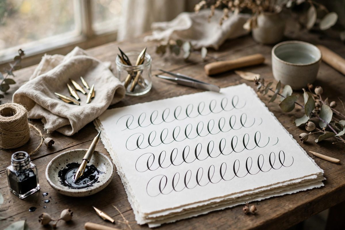
A well-formed ascender loop has three qualities: consistent height, consistent width, and a clean shape. Height is set by guidelines: the ascender line should be a fixed multiple of the x-height, commonly around three times, and every loop should kiss that line without overshooting or falling short. Width should be uniform across loops, wide enough to read as an open loop rather than a collapsed stem, narrow enough to stay elegant. The shape turns smoothly at the top, with the upstroke and downstroke nearly parallel through the loop's body, and the loop closes cleanly at the baseline without a blob or a gap. The slant must match the script's overall slant exactly; a loop leaning at a different angle than its neighbors breaks the rhythm visibly. Drill loops in rows, comparing each to its neighbors, until uniformity is automatic.
Pressure and the shaded downstroke
Modern script shades the downstroke of the loop: pressure on the way down creates the thick stroke that contrasts with the hairline upstroke. The pressure must be consistent across loops, building smoothly to full shade at the loop's widest point and releasing cleanly as the stroke returns to the baseline. Inconsistent pressure produces loops with lumpy shading or with shade in different places, which reads as hesitation. The transition points matter most: where the hairline upstroke turns into the shaded downstroke at the top of the loop, and where the shade releases at the bottom. Practice these transitions slowly before attempting them at writing speed; the muscle memory for smooth pressure changes builds only through deliberate repetition. Keep the pen's pressure moderate overall; gorilla pressure damages nibs and produces crude, blobby shades.
Loops in context: words and spacing
Balanced loops in isolation are only half the skill; they must stay balanced inside real words, where neighboring letters tug at spacing and rhythm. Maintain consistent spacing between the loop and adjacent letters: the loop needs its full width plus a breath of white space on each side, and crowding it against neighbors collapses its elegance. Watch the baseline where loops return: every loop should land on the baseline at the same point in its stroke cycle, keeping the writing's foundation level. In words with multiple ascenders, consciously match the loops to each other as you write; the natural tendency is for later loops to shrink as the hand hurries, so slow down slightly for the second and third ascenders. Step back frequently and view the line as a whole: the loops should form a regular, rhythmic skyline, not a series of individual events.
Guidelines, tools, and critique
Write on proper guidelines until the proportions are internalized: x-height, ascender line, and slant lines all marked, because the loop's balance is measured against these references. Use a nib suited to the scale; too stiff a nib fights the pressure transitions, too flexible a nib is hard to control. Critique your work by covering the body of the writing and looking only at the loops: do they match in height, width, slant, and shading? This isolation exercise reveals imbalances the full word hides. Study exemplars from master penmen, tracing their loops to feel the consistency in your own hand. The freedom of modern script is real, but it is freedom built on the discipline of the balanced loop.
Same height, same width, same slant, same shading, every loop, every word. Balance the ascenders and the script takes care of itself; neglect them and no amount of flourishing will save it.
Related Guides
- Flourishing Descender Loops in Copperplate Scripts: Copperplate descender loops are where a page either looks elegant or looks busy, and the difference is discipline. The long-tailed letters (g, j, y
- Flourish Oval Proportions for Envelope Headers: The envelope header, the name written large across the front, is modern calligraphy's stage, and flourishing is its choreography. The oval is the
- Copperplate Slant Angle Consistency at 55 Deg: Copperplate's elegance comes from its dramatic slant, traditionally 55 degrees from the baseline, and the script falls apart when that angle wanders