
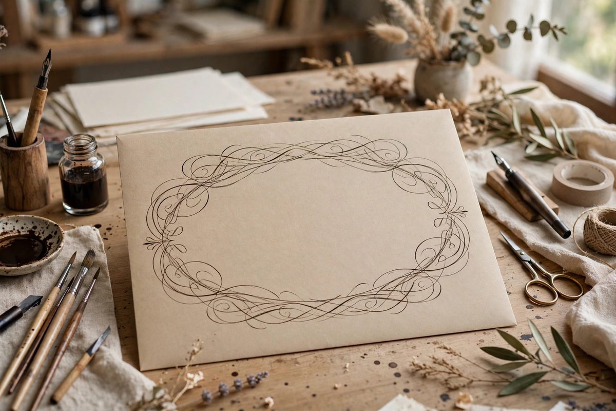
The envelope header, the name written large across the front, is modern calligraphy's stage, and flourishing is its choreography. The oval is the fundamental flourish shape: the looping ellipse that underlines, encircles, and extends the lettering. Its proportions determine whether the flourish looks elegant or awkward, intentional or accidental. An oval too round looks blobby; too flat looks strained. Getting the proportions right is the difference between a header that sings and one that merely shouts.
Why the Oval Is the Master Shape
Nearly every flourish reduces to ovals: the underlining swash is a stretched oval, the encircling loop is a tilted oval, the cascading descender flourish is a series of nested ovals. The hand that can draw a clean, well-proportioned oval at any size and angle has the vocabulary for all flourishing. The hand that cannot will produce flourishes that wobble, kink, and collapse no matter how beautiful the lettering they surround.
The oval suits the pointed pen's mechanics. The pen naturally wants to move in ellipses: the downstroke's pressure and the upstroke's release trace an oval path with minimal hand contortion. Fighting this by forcing circular or angular flourishes works against the tool; the oval is what the pen wants to draw.
Proportions That Read as Elegant
The pleasing oval for flourishing is longer than it is tall, typically in a ratio around two to one or slightly more, tilted to echo the script's slant. This proportion reads as movement: the eye follows the long axis, which gives the flourish its sense of flow. A rounder oval reads as static, a bouncier shape that sits rather than sweeps.
The oval should also be consistent within a piece. If the underlining flourish is a long, low oval and the encircling flourish is nearly circular, the two shapes argue with each other. Pick a proportion family for the header and hold it across all the flourishes; consistency of shape language is what makes varied flourishes feel unified.
Drawing the Oval Cleanly
Draw ovals with the whole arm, not the fingers. Anchor the wrist or let it float, and drive the motion from the shoulder and elbow; finger-drawn ovals wobble because the fingers cannot sustain a smooth ellipse. Practice ovals as a drill, pages of them, until the shape is automatic at multiple sizes. The drill is boring and essential.
Enter and exit the oval on its long axis, flowing in from the lettering and out to the next element without a visible joint. The flourish should read as one continuous gesture that happens to pass through the lettering, not as decoration applied afterward. That continuity is what separates flourishing from doodling around words.
- Keep the oval's line weight consistent with the script; a hairline flourish around shaded letters looks anemic.
- Let ovals cross each other cleanly; hesitant, wobbling crossings look tangled.
- Size the flourish to the header; a tiny flourish on a large name looks timid, a huge one looks desperate.
- Leave breathing room; flourishes that crowd the lettering suffocate it.
Placing Flourishes on the Envelope
The envelope is a rectangle with an address zone to respect, and the header flourish must live in the remaining space. Plan the composition before inking: pencil the name's position, sketch the flourish ovals lightly, and check that nothing collides with the stamp corner or the address lines. A gorgeous flourish that runs into the postage area is a failure of planning, not of penmanship.
Balance the flourish's visual weight against the name. A heavily shaded name wants a lighter, airier flourish for contrast; a delicate name can carry a bolder flourish. The two elements should converse, not compete. When in doubt, simplify: one well-placed oval beats three fighting ones.
Knowing When to Stop
The most common flourishing error is excess. Each additional oval adds complexity, and complexity has a tipping point where elegance becomes clutter. The discipline is to flourish the name, step back, and ask whether each loop earns its place. Loops that do not contribute to balance, movement, or emphasis should go.
Restraint reads as confidence. The calligrapher who flourishes sparingly signals mastery; the one who flourishes everywhere signals insecurity. Let the lettering carry the header, and let the ovals, well-proportioned and well-placed, carry the eye.
Two-to-one ovals, drawn from the arm, consistent across the piece, placed with respect for the envelope's geography, and stopped before excess. The flourish oval is a simple shape; its mastery is in the proportion, the placement, and the discipline to quit while ahead.
Related Guides
- Balancing Ascender Loops in Modern Script Fonts: Modern pointed-pen script seduces with its flourishes, but its elegance actually rests on discipline: the consistent, balanced loops of its
- Copperplate Slant Angle Consistency at 55 Deg: Copperplate's elegance comes from its dramatic slant, traditionally 55 degrees from the baseline, and the script falls apart when that angle wanders
- Flourishing Descender Loops in Copperplate Scripts: Copperplate descender loops are where a page either looks elegant or looks busy, and the difference is discipline. The long-tailed letters (g, j, y