
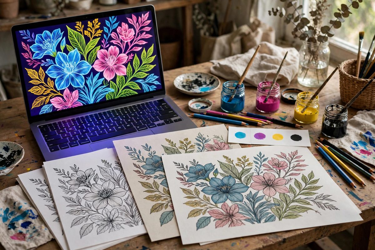
Digital linework destined for print lives in two color worlds: the glowing RGB of the screen and the ink-on-paper CMYK of the press. Colors that look vivid on screen can print dull, shifted, or muddy if the gamut was never matched to the output profile. Understanding gamut and profile matching keeps the printed linework faithful to the artist's intent.
What Gamut Means for Linework
Gamut is the range of colors a device or process can reproduce. A monitor's RGB gamut is large, especially in bright cyans, greens, and magentas; a printing press's CMYK gamut is smaller, particularly in saturated brights. Any screen color outside the press gamut cannot be printed as seen; it gets clipped or remapped to the nearest printable color, usually becoming duller. For linework, where flat color areas and precise hues carry the design, an unexpected gamut shift changes the artwork's character. A neon accent color chosen on screen may print as a flat mid-tone. The fix is not to avoid bright colors but to work inside the output gamut from the start, choosing colors that survive the translation.
Working With the Output Profile
An ICC profile describes a specific output device's color behavior, and the correct profile for the intended press and paper is the foundation of matching. Set the document's CMYK working space to the profile the printer specifies, and soft-proof with it regularly; soft-proofing simulates on screen how the colors will print, revealing gamut problems while they are still editable. When the printer has not specified a profile, use a widely accepted standard profile for the paper type, coated or uncoated, since paper absorbency changes everything. Never design print linework in an unmanaged RGB document and convert at the end; the conversion then happens blind, and the surprises arrive on press. Profile-first workflow is the professional standard because it eliminates an entire class of disappointment.
Choosing Colors Inside the Gamut
Build the palette from CMYK-safe colors. In most art software, the color picker can warn when a chosen color falls outside the CMYK gamut; enable that warning and treat it as a hard stop for print work. Favor colors mixed from the process inks' natural strengths: rich cyans, warm magentas, and deep yellows reproduce well, while electric greens and vivid violets are the classic casualties. For black linework, use a rich black (black plus supporting CMY) for large areas and pure black for fine lines, since fine lines in rich black can misregister into a colored halo. Test the palette by printing proofs on the actual paper; screen simulation is good, but a physical proof is the truth.
Linework-Specific Concerns
Linework has particular vulnerabilities. Thin colored lines can disappear or shift if the color is built from multiple plates that misregister slightly; keep fine lines to one or two plates where possible. Anti-aliased edges blend the line color with the background, creating intermediate colors that may fall outside the gamut even when the line and background are both safe; check critical edges in soft-proof. Gradients in CMYK can band, especially in skies and shadows behind linework; add a touch of noise or use the printer's recommended gradient practices. Trapping, the slight overlap of adjacent colors, matters where flat color areas meet in the linework; discuss it with the printer rather than guessing.
Proofing and Printer Communication
The proof is the contract between artist and printer. Review contract proofs under standard lighting, since colors shift dramatically under different bulbs, and sign off only on what you have seen. Communicate the intent: if a particular color is critical, say so, and provide a printed reference if possible. Ask the printer about their preferred file setup, PDF standards, and any color handling they want done on their end. A five-minute conversation before starting the artwork prevents the most common gamut disasters. Keep the layered working files archived with the profile embedded, so reprints years later match the original run.
Match the gamut to the press before choosing colors, work in the output profile with soft-proofing on, keep fine lines on few plates, and proof on the real paper. The screen is a promise; the profile is what keeps it.
Related Guides
- Managing Vector Node Density in Linework Paths: Vector linework is built from nodes, the anchor points that define a path's curves, and node density, how many anchors describe a given length of
- Custom Brush Pressure Curves for Digital Inking: A pressure curve maps how hard you press on your stylus to how thick, opaque, or wide the digital brush stroke becomes. The default curve in most
- Managing Vector Anchor Point Weight for Clean Curves: Every smooth curve in a vector drawing is a negotiation between anchor points and their bezier handles, and the number of points on the curve decides