
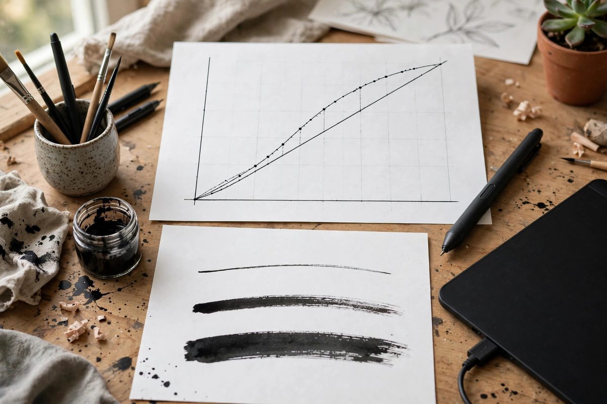
A pressure curve maps how hard you press on your stylus to how thick, opaque, or wide the digital brush stroke becomes. The default curve in most drawing software is a straight diagonal line: press halfway, get half the effect. That sounds fair, but almost no illustrator inks with a linear response, because the human hand does not work that way. Light touches drift, heavy presses bunch up, and the middle of the range is where your actual drawing lives. Building a custom curve is one of the fastest ways to make digital inking feel like a real nib on paper.
What the Curve Controls
The pressure curve is a graph with input pressure on the horizontal axis and output (size, opacity, flow, or a blend of these) on the vertical axis. The default 45-degree line says input equals output across the whole range. Your hand spends most of a drawing stroke in the bottom third of the pressure range, so with a linear curve, half your output resolution lives in a zone you rarely visit. The practical fix is to bow the curve upward early: a steep rise from zero to about 40% of your output within the first quarter of pressure, then a gentler climb for the rest. This spreads your useful resolution across the pressures you actually use, so small hand movements produce fine gradations instead of jumps.
Reading Your Own Pressure Range
Before touching any settings, draw a slow, steady stroke that gradually goes from the lightest mark you can make to the hardest press you would use on a real drawing. Look at where the line actually thickens. Most people discover their comfort zone sits roughly between 10% and 60% of the tablet's total pressure range; beyond that you are bearing down in a way that would gouge paper. Note where your stroke tapers to a point and where it reaches your boldest width: those landmarks define the active range your curve must serve. Compress everything outside them.
Building a Taper-First Curve
For inking, the critical job of the curve is the taper: how the stroke lifts off at the end of a line. A good inking curve starts with a soft, nearly flat region at the very bottom of the input range. This gives you feathered entries, where the line fades in rather than popping on. The steepest part of the curve should sit in your low-to-mid pressure zone, so the line blooms quickly from a hairline to your working width with a small pressure increase. Above that, flatten the curve again. You want extra pressure to thicken the line only modestly; this prevents accidental blobbing when you lean into a curve. The resulting shape is an S-curve with the top plateau longer than the bottom ramp. Test it by inking teardrop shapes: each should taper at both ends with a controlled belly in the middle, all in one stroke.
Separating Size From Opacity Curves
Most brushes let you assign independent curves to size and opacity, and inking usually wants them different. Opacity often works best on a nearly linear or even aggressive curve, because ink is ink: once you lay it down it is black. A brush that gets darker only when you press hard creates washy gray mid-tones that look like pencil, not ink. Set the opacity curve high and flat early, jumping to full opacity in the lower third of pressure, while size gets the S-curve described above. A real brush pen lays down full pigment density at any touch, but its line width tracks pressure. Matching that behavior digitally is what makes the result read as inking rather than sketching.
Tuning for Your Stylus Hardware
Not all styluses report pressure the same way. Some nibs feel soft and compress a long way before bottoming out, which effectively gives you a wider usable input range; others are stiff and hit maximum quickly, which concentrates your control in a narrow band. Check your tablet driver's own pressure test panel first and confirm the full range registers before you touch the software curve. If your software supports tilt-based taper, you can lighten the pressure curve's job and let tilt handle some modulation.
Testing on Real Linework
Curves tuned in a test panel often fail on actual drawing, because your hand changes its pressure habits once you are concentrating on the image. The reliable test is to ink a full page of your normal work: hatching, contours, a few spot blacks. Watch for two failure modes. If your tapers keep snapping off blunt, the bottom of the curve is too steep; soften it. If bold accents never quite arrive and everything feels thin, the top of the curve is flattening too early, or your hardware is not reaching full pressure. Many artists keep two presets: an aggressive taper curve for comic-style linework, and a flatter one for technical inking where uniform line weight matters.
Your pressure curve is the single most personal setting in digital inking, closer to choosing a nib grade than to a software preference. Get it right once and it disappears from your awareness, leaving only the feeling that the tool is doing what your hand asked. Revisit it whenever your hardware changes, and keep the taper test as your standard check.
Related Guides
- Managing Vector Anchor Point Weight for Clean Curves: Every smooth curve in a vector drawing is a negotiation between anchor points and their bezier handles, and the number of points on the curve decides
- Managing Vector Node Density in Linework Paths: Vector linework is built from nodes, the anchor points that define a path's curves, and node density, how many anchors describe a given length of
- Color Gamut Profile Matching in CMYK Linework: Digital linework destined for print lives in two color worlds: the glowing RGB of the screen and the ink-on-paper CMYK of the press. Colors that look