
Midtones are the hardest value range in pen drawing. Shadows are easy: pack lines densely and go dark. Highlights are easy: leave the paper alone. The middle values need a texture that reads as gray from across the room yet still looks like deliberate mark-making up close. Cross hatching solves this by layering line sets at angles, and the density of those lines, how close together they sit, is the dial that tunes the value. Learning to control density is learning to control tone without ever touching a wash or a gray marker.
How Line Density Creates Value
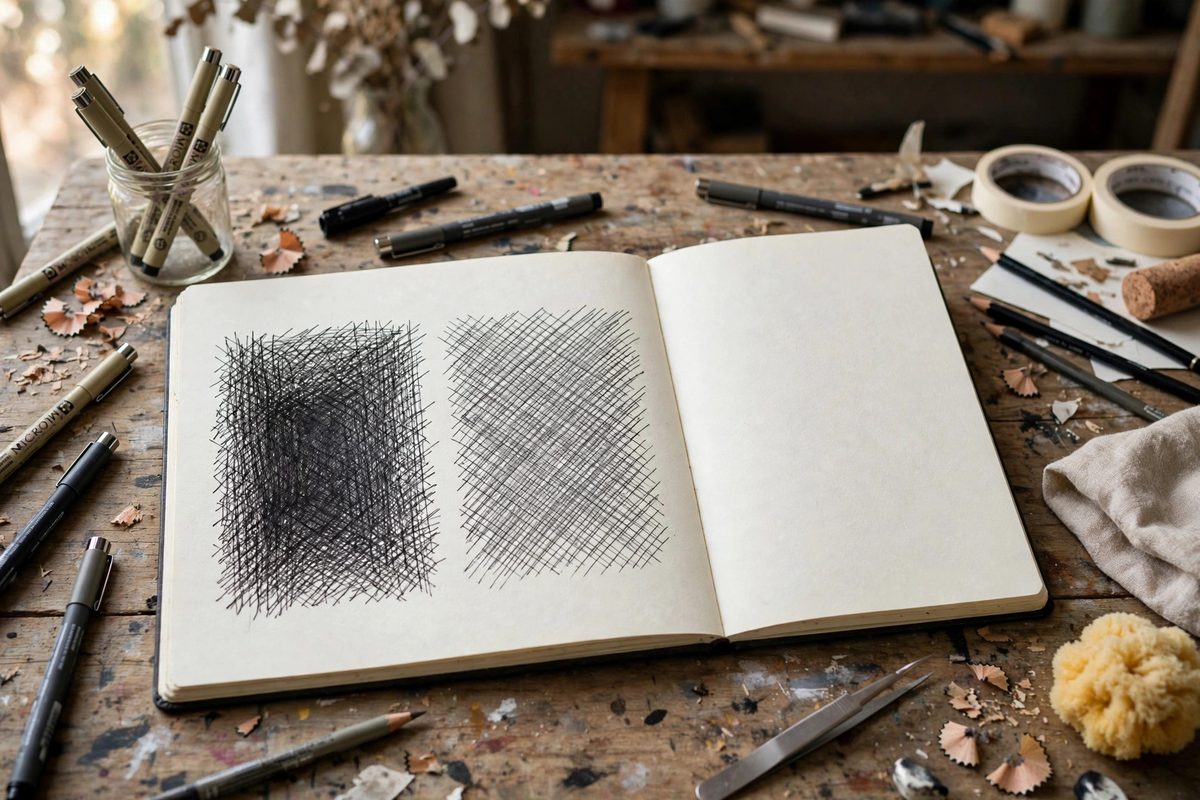
From a distance, the eye averages the white of the paper with the black of the ink lines. Wider line spacing leaves more paper visible, so the average reads lighter; tighter spacing covers more paper, so the average reads darker. This is the whole trick. A single layer of parallel lines at moderate spacing gives you a light-to-middle gray. Adding a second layer at an angle doubles the ink coverage in the overlaps and, because the eye now also averages the diamond-shaped paper gaps between crossings, the tone deepens further. The key insight is that value comes from coverage ratio, not from pressing harder. Two light, evenly spaced layers look smoother and more controlled than one layer of heavy, uneven lines. Think in coverage: roughly a quarter of the paper covered reads as a light midtone, half as a middle gray, three quarters toward shadow.
The Angle of the Second Pass
The crossing angle changes the character of the tone as much as the density. Angles near 90 degrees produce a neutral, even gray: the crossings are symmetric and the paper gaps are uniform diamonds. Shallower angles, around 30 to 45 degrees, create elongated gaps that lean in one direction, giving the tone a directional grain that can follow a form, like the curve of a cheek or the grain of wood. But when the second layer runs too close to parallel with the first, the lines merge into a muddy band and you lose the crispness that makes hatching look intentional. Keep at least 30 degrees between layers. Three layers is usually the practical limit for midtones; beyond that the tone tips into shadow territory and the texture starts to fill in completely.
Spacing Discipline
Even spacing is what separates professional-looking hatching from scribble, and it is almost entirely a matter of hand mechanics. The reliable method is to draw each layer in one pass of parallel strokes without pausing, letting your shoulder set the rhythm. Resist filling thin spots within a layer: Those touch-ups break the rhythm and create dark seams. If a layer comes out too open, lay another full layer rather than patching. Consistency matters more than hitting an exact measurement; a layer spaced at a steady, slightly-wide interval looks far better than one that wavers between tight and open. Beginners do best starting with spacing about four or five times the line width.
Building Midtones in Stages
Approach a midtone area in deliberate stages rather than committing to final darkness immediately. Lay the first directional layer along the form, following its contours, at a spacing that reads just barely gray. Step back and evaluate: squint, which merges the lines into tone. If it needs to go darker, add the second layer at an angle, spaced slightly tighter. Squint again. Only then decide whether a third layer is warranted. This staged method has a mechanical advantage: each layer dries before the next, so there is no smearing. It also prevents the classic beginner error of overshooting into shadow on the first pass and then having nowhere to go. You can always darken a midtone; you cannot lighten one.
Edge Control Within the Tone
A midtone patch with a hard, even border looks pasted on. Real form transitions are gradual, and your hatching density should graduate at the edges of the tone. Two techniques handle this. Feather the line lengths: let each hatch stroke taper or stop progressively shorter as you approach the highlight side, so the coverage ratio falls off smoothly. Or fan the spacing: keep the lines long but widen the gaps toward the edge. Both create a gradient without changing ink weight. The darker side of the patch gets full-length, evenly spaced strokes; the transition side thins out. Practice on a simple sphere: the midtone band should melt into highlight on one side and shadow on the other, through spacing changes alone.
Matching Density to Tool
Line density and tool choice interact. A fine nib lays thin lines, so you need tighter spacing to reach the same coverage, which means more strokes and more patience, but the result is a refined, detailed midtone. A broader nib covers paper faster, so the same tone needs wider spacing, and the texture becomes bolder and more graphic. Pick the tool for the drawing's scale and mood: fine nibs for close, delicate work; bolder pens for large or expressive pieces. Switching tools mid-tone without adjusting spacing produces a visible patch; adjust your spacing target immediately and test on scrap first.
Midtone hatching is a coverage problem, not a pressing problem. Stage your layers, keep the spacing honest, let the edges graduate, and squint often. The gray you need is already there in the paper; the lines just decide how much of it shows.
Related Guides
- Learn One-Point Perspective Drawing: Draw Realistic 3D Scenes on Flat Paper Ever wondered how artists make drawings look three-dimensional? The secret is perspective - the technique of
- Graphite Grade Stacking for High Contrast Tones: High contrast drawing, the kind with deep, velvety blacks against luminous paper white, is not achieved by pressing harder with one pencil. It is
- Stumping and Smudge Blending on Toned Paper: Toned paper, with its middle-value gray or tan surface, lets the sketcher work both directions: dark charcoal or graphite for shadows, white chalk or
- Graphite Grade Stacking for Seamless Value Gradients: A seamless value gradient in graphite does not come from pressing harder with one pencil. It comes from stacking grades: laying each hardness in its