
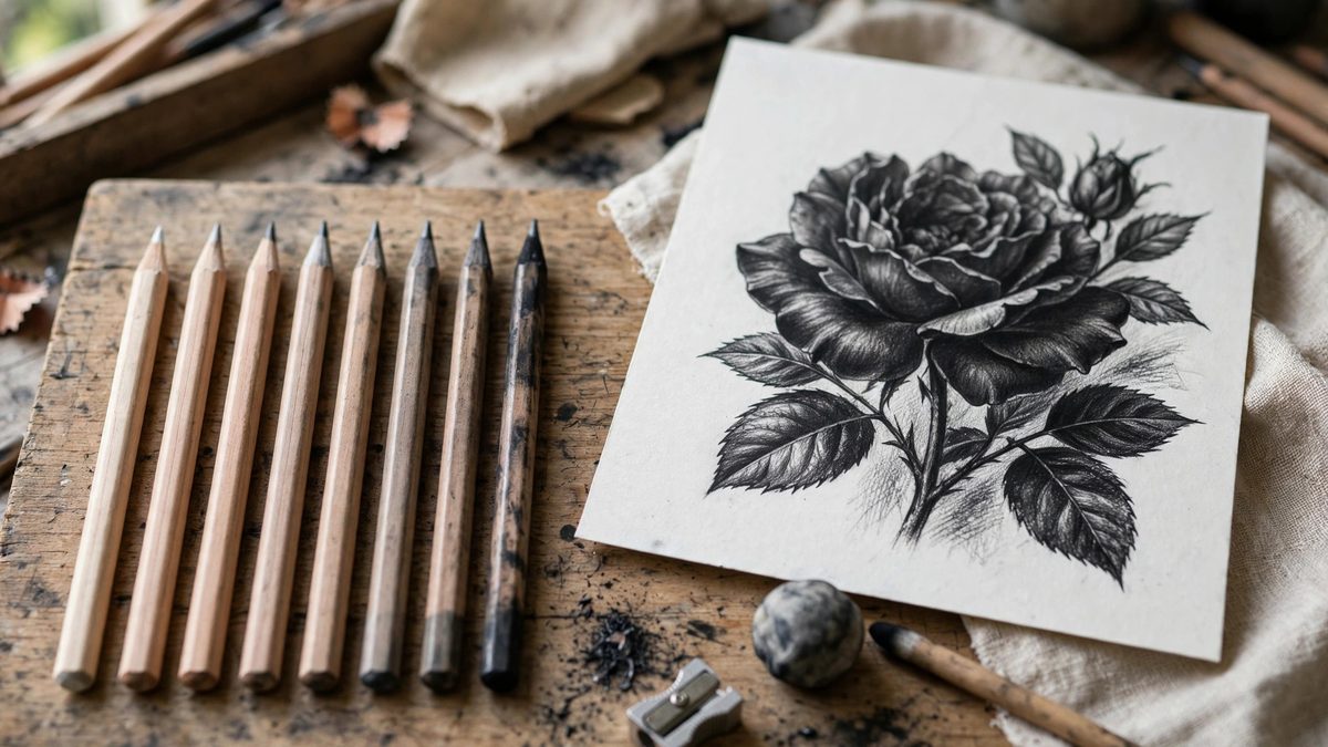
High contrast drawing, the kind with deep, velvety blacks against luminous paper white, is not achieved by pressing harder with one pencil. It is achieved by stacking graphite grades: building tones in layers, each grade doing the job it does best, from the hard grades that lay precise light structure to the soft grades that deliver the darks. A drawing done in a single grade has a narrow tonal range no matter how hard you press; a drawing stacked across the grade range has the full piano keyboard.
What the Grades Actually Are
Graphite pencils grade from hard (H) to soft (B), with the number indicating degree. Hard grades contain more clay binder and less graphite: they make light, precise, slightly silvery marks and hold a sharp point. Soft grades contain more graphite and less clay: they make dark, rich marks and wear down fast. The middle grades bridge the two. No single grade covers the full tonal range of a high contrast drawing; the range is the point of the system.
Understanding the grades as a division of labor changes how you draw. The H grades are for construction: light lines, precise edges, initial mapping. The middle grades build the mid-tones. The B grades deliver the darks. Each layer goes down on top of the last, and the drawing's contrast comes from the distance between the lightest light and the darkest dark, not from any single mark.
The Stacking Sequence
Work light to dark, hard to soft. Lay the drawing's structure with a hard grade, mapping proportions and major value shapes in lines light enough to adjust. Build the mid-tones with middle grades, establishing the full value structure before any real darks go down. Then, and only then, bring in the soft grades for the deepest shadows and accents.
This order matters for a physical reason: soft graphite over hard graphite works, but hard graphite over soft graphite skates and shines. The hard pencil's point cannot bite into a waxy soft-graphite layer; it slides, burnishing the surface instead of marking it. Once the soft grades are down, that area's tonal development is essentially finished. Plan accordingly.
Building Darks Without Shine
The enemy of high contrast graphite work is the metallic sheen that appears when graphite is overworked: the surface becomes reflective, and the "black" reads as gray from most viewing angles. The defense is layering rather than pressure. Multiple light layers of a soft grade build a deeper, more matte black than one heavy-handed layer, because each layer adds graphite without fully burnishing the one beneath.
- Rotate the pencil as you work to keep a fresh point edge; a flat spot burnishes.
- Vary stroke direction between layers; cross-hatching layers build density without shine.
- Use the softest grade only where the drawing truly needs maximum dark; overuse flattens the value range.
- Reserve the paper white fiercely; erased-back highlights never match untouched paper.
Paper's Role in the Stack
Toothy paper holds more graphite layers before burnishing, which extends the achievable dark range; smooth paper burnishes sooner, which limits it. For maximum contrast, choose a paper with enough tooth to accept the full stack. The paper's tone also sets the drawing's light end: white paper gives the highest contrast ceiling, while toned paper compresses the range but adds atmospheric unity.
Test the full grade stack on the project paper before committing. The darkest dark you can achieve without shine, on that paper, with your hand, is the drawing's actual black; calibrate the whole value plan to it. A value scale drawn on the project paper is the most useful preparatory drawing you can make.
Fixative and the Finished Stack
Soft graphite layers are fragile: they smudge, lift, and transfer. Workable fixative between major stages lets you build further without disturbing finished areas, and a final fixative coat protects the drawing. But fixative slightly darkens and can add its own sheen, so test it on the value scale first and account for the shift.
Handle the finished drawing by the edges, store it interleaved with glassine, and frame high contrast work under glass. The deep darks you built with the soft grades are the drawing's glory and its vulnerability; protect them.
Hard grades for structure, middle grades for the value map, soft grades layered lightly for the darks, and the paper's white held sacred throughout. Contrast is a range, and the range is built one grade at a time.
Related Guides
- Graphite Grade Stacking for Seamless Value Gradients: A seamless value gradient in graphite does not come from pressing harder with one pencil. It comes from stacking grades: laying each hardness in its
- Learn One-Point Perspective Drawing: Draw Realistic 3D Scenes on Flat Paper Ever wondered how artists make drawings look three-dimensional? The secret is perspective - the technique of
- Cross Hatching Line Density for Midtone Shading: Midtones are the hardest value range in pen drawing. Shadows are easy: pack lines densely and go dark. Highlights are easy: leave the paper alone
- Stumping and Smudge Blending on Toned Paper: Toned paper, with its middle-value gray or tan surface, lets the sketcher work both directions: dark charcoal or graphite for shadows, white chalk or