
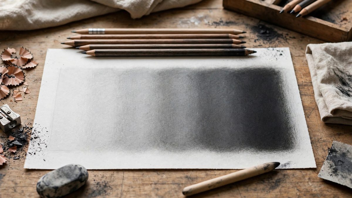
A seamless value gradient in graphite does not come from pressing harder with one pencil. It comes from stacking grades: laying each hardness in its own zone and blending the transitions where they overlap. Hard grades (H range) lay down light, waxy-smooth value; soft grades (B range) lay down dark, rich value. Used in sequence with deliberate overlap, they produce a gradient with no visible steps and no muddy middle, which is something a single pencil simply cannot do no matter how carefully you shade.
Why one pencil always shows steps
A single graphite grade has a limited value range. An HB can be coaxed from a light gray to a medium gray, but the darks stay anemic and the lights stay flat, because you are fighting the graphite-to-clay ratio the whole way. Pressing harder darkens the mark but also burnishes the paper, and burnished paper will not take more graphite, so the value stalls. Switching to a softer grade for the darks and a harder grade for the lights lets each pencil work in the range where it behaves best.
There is also a texture reason. Hard grades leave a fine, tight mark; soft grades leave a coarse, crumbly one. A gradient drawn with one grade has uniform texture throughout, which makes the value steps more visible, because the eye has no textural variation to distract it. Stacking grades introduces subtle texture shifts that the eye reads as continuous tone.
A practical stacking sequence
Start with the lightest value in the gradient using an H or 2H, covering slightly more area than the light zone will finally occupy. The overlap into the next zone is intentional. Then lay the mid value with an HB or B, starting inside the previous layer's territory so the two grades interleave. Finish the dark end with a 2B through 6B depending on how dark the gradient needs to go, again starting inside the previous zone.
The key discipline is direction: always work from light to dark, and never go back to a harder grade over a softer one. Hard graphite over soft graphite skates on the crumbly layer and leaves shiny streaks. Soft over hard works fine, because the soft grade's binder fills the tooth the hard grade left behind.
Blending the overlaps
The overlap zones are where the gradient either disappears or announces itself. Blend them while the graphite is fresh, using a tortillon, a chamois, or a soft brush, with a light circular motion that mixes the two grades at the boundary. The goal is to make the transition zone read as a value that belongs to neither grade, a smooth ramp between them.
Blend less than you think you need to at first. Over-blending homogenizes the texture and can push graphite into the paper so thoroughly that the area will not take further layers. You can always blend more; you cannot un-blend. After blending, re-establish the darkest darks with the soft grade alone, since blending always lightens the maximum value a little.
Paper tooth and layer limits
Every sheet of paper has a finite capacity for graphite, set by its tooth. Smooth papers fill up fast: two or three layers and the surface is saturated, which is why seamless gradients on smooth paper demand efficient stacking with minimal reworking. Papers with more tooth accept more layers and reward a slower build, but they also show more texture in the finished gradient.
Watch for the shine that signals a saturated surface. When the graphite starts to reflect light, the tooth is full and further layering will only smear. If you reach saturation before the gradient is dark enough, the fix is softer graphite applied earlier in the sequence, not more pressure. Pressure is the enemy of layering; it fills tooth without adding value.
Fixative between stages
For very long gradients or very dark endpoints, a light spray of workable fixative between the mid and dark stages locks the lower layers in place and restores some tooth for the soft grades to grip. Use it sparingly and from the recommended distance, since heavy fixative darkens the values underneath and changes how subsequent graphite behaves. Let it dry completely before continuing.
Stack light to dark, overlap generously, blend with restraint, and respect the paper's limits. The gradient that results will have no steps, no shine, and no apology, just tone doing exactly what you asked of it.
Related Guides
- Graphite Grade Stacking for High Contrast Tones: High contrast drawing, the kind with deep, velvety blacks against luminous paper white, is not achieved by pressing harder with one pencil. It is
- Learn One-Point Perspective Drawing: Draw Realistic 3D Scenes on Flat Paper Ever wondered how artists make drawings look three-dimensional? The secret is perspective - the technique of
- Cross Hatching Line Density for Midtone Shading: Midtones are the hardest value range in pen drawing. Shadows are easy: pack lines densely and go dark. Highlights are easy: leave the paper alone
- Stumping and Smudge Blending on Toned Paper: Toned paper, with its middle-value gray or tan surface, lets the sketcher work both directions: dark charcoal or graphite for shadows, white chalk or