
Textura quadrata, the dense blackletter of medieval manuscripts, gets its unmistakable texture from one thing above all: the broad nib held at a constant angle. Every thick and thin in the script is a direct consequence of that angle, and any wobble in it shows immediately as strokes that are inexplicably fat or thin. Nib angle consistency is not one skill among many in textura; it is the skill, the foundation on which the script's rhythm, density, and legibility all rest.
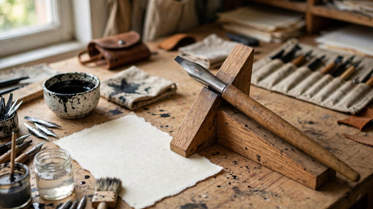
Why the angle defines the script
A broad nib makes its widest mark when pulled perpendicular to its edge and its thinnest when pulled parallel. Textura quadrata is traditionally written with the nib at roughly 30 to 45 degrees to the baseline, and that angle determines the stroke contrast throughout: vertical stems come out near-maximum width, the angled strokes vary accordingly, and the thin hairline serifs emerge from near-parallel pulls. Change the angle mid-word and the logic breaks: stems that should match come out different widths, and the page loses the woven uniformity that gives textura its name (textura means texture, or weave). The medieval scribes who wrote books this way held their angle for hours; the consistency was professional discipline, not talent. Modern students earn it the same way: deliberate practice until the hand holds the angle without conscious effort.
Establishing and checking the angle
Set the nib angle with intention before writing a single letter. Many calligraphers draw light angle guide lines on their practice sheets, short slashes at the target angle in the margins, and glance at them to recalibrate. Hold the pen so the nib's edge meets the paper at the chosen angle and keep the wrist and arm positioned to maintain it; most angle drift comes from rotating the hand as it moves across the page, especially on long lines. Check your work by examining stem widths: in a well-written line of textura, all vertical stems should be identical in width. Any variation is angle drift made visible. Video or a mirror can reveal hand rotation you cannot feel; the angle feels constant long before it is constant, and external feedback closes that gap faster than feel alone.
The quadrata details: feet and heads
Textura quadrata is distinguished by its diamond-shaped feet and heads: the strokes terminate in angled cuts that give the script its crisp, rhythmic texture. These details depend entirely on nib angle consistency, because each foot is formed by the nib's edge meeting the paper at the established angle. Inconsistent angle produces feet that vary in shape and size, destroying the regularity the script demands. Practice the basic strokes, the vertical stem with its quadrata foot, the angled connectors, the arches, in isolation until each is automatic at the correct angle. Then assemble letters, watching the joins where strokes meet: the joins are where angle errors compound, as two slightly-off strokes create a visibly wrong corner. Slow down at the joins; speed comes after consistency.
Spacing, density, and the texture
Textura's visual power comes from density: letters packed tightly, words separated by small spaces, lines set close together, creating the page of woven black that medieval readers loved. This density magnifies angle inconsistency, since every stroke sits cheek-by-jowl with its neighbors and any rogue width disrupts the pattern. Maintain consistent inter-letter spacing as rigorously as the nib angle; the two consistencies multiply into the texture. Use guidelines for x-height, ascenders, and descenders, keeping them tight as the script demands, and let the white space inside and between letters form its own regular pattern. The goal is a page where no single letter draws attention, because every letter obeys the same angle, the same weight, the same rhythm.
Tools and practice
Use a broad nib suited to the script's scale: the nib width determines the x-height (traditionally around four to five nib widths for textura), so choose the nib for the size you want to write. Keep the nib clean and properly inked; a clogged or scratchy nib forces pressure changes that disturb the angle. Practice on lined guideline sheets until the angle is second nature, then graduate to unlined work with only faint guides. Study historical exemplars to calibrate your eye: the best medieval textura shows an angle discipline that humbles modern students, and it sets the standard to aim for. The script rewards patience extravagantly; every hour of angle drills shows directly in the work.
Fix the angle, hold it through every stroke, and let consistency build the texture. In textura quadrata, the nib angle is the script: master it and the letters follow.
Related Guides
- Pressure Ratios for Flexible Brush Calligraphy: Flexible brush calligraphy creates its signature thick-and-thin contrast through pressure: press harder and the bristles spread, laying down a broad
- Dry Brush Pressure Timing on Textured Parchment: Dry brush lettering, where a relatively dry brush skips across the paper leaving broken, textured strokes, is a study in controlled imperfection. On
- Gum Arabic Dilution for Pointed Pen Pigments: Pointed pen work with pigments, gouache, watercolor, or powdered color mixed by hand, depends on a binder that flows off the nib smoothly and dries
- Calculating Baseline Ratios in Rotunda Scripts: Rotunda, the rounded southern European book hand, has a distinctive compact rhythm that comes from its proportions. The baseline ratios, the
- Fine Hair Spring Tensioning for Controlled Brush Lines: A fine brush line, the hairline stroke of pointed pen or brush lettering, is controlled not by the hand alone but by the brush's spring: the way the