
Flexible brush calligraphy creates its signature thick-and-thin contrast through pressure: press harder and the bristles spread, laying down a broad stroke; ease off and they snap back to a fine point for hairlines. The ratio between the heavy pressure and the light touch, how much harder you press for downstrokes versus how lightly you float the upstrokes, is the fundamental control of the art. Mastering that ratio turns shaky, uneven lettering into the rhythmic, breathing strokes that define the style.
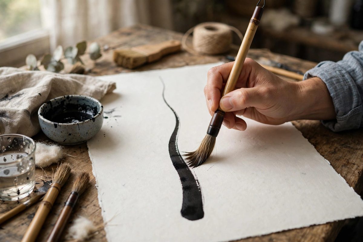
How the brush responds to pressure
A brush pen or pointed brush is a bundle of bristles that spreads under load. Light pressure keeps the bundle together at its point, producing a hairline; increasing pressure splays the bristles outward, widening the mark in proportion to the force. The relationship is not linear: the first bit of pressure widens the stroke quickly, while additional pressure adds width more slowly as the bristles reach their spread limit. This means the usable pressure range has a sweet zone, and pressing past it just mushes the bristles without adding useful width while damaging the tip. The skill is living in the sweet zone: enough pressure for a confident thick stroke, never so much that the brush complains. Different brushes have different sweet zones, which is why switching brushes always requires recalibration.
The downstroke-upstroke ratio
The core rhythm of brush calligraphy is the contrast between thick downstrokes and thin upstrokes. As a working ratio, think of the downstroke pressure as roughly three to four times the upstroke pressure: the upstroke floats with barely more than the brush's own weight, while the downstroke presses firmly and deliberately. Beginners typically err in both directions at once: upstrokes too heavy, producing wobbly thick-thins instead of hairlines, and downstrokes too timid, producing anemic thicks with no confidence. Drill the extremes separately: pages of hairline upstrokes at the lightest touch you can manage, then pages of full-pressure downstrokes, before combining them into letters. The hand learns the two pressures as distinct gears, and fluency comes from shifting between them without thinking.
Loading and ink flow
Pressure control means nothing without consistent ink flow. A brush pen that is running dry forces you to press harder to get any mark, which destroys the pressure ratio; keep the brush well supplied, whether that means dipping a traditional brush or ensuring a brush pen's feed is flowing. Load a dip brush fully but not dripping, and work with the brush's natural ink capacity: a full brush gives several good strokes before needing a reload, and the stroke quality degrades gracefully as the ink depletes, which experienced calligraphers use deliberately for texture. If your thicks are coming out ragged, check the ink supply before blaming your pressure; nine times out of ten, the brush is thirsty, not the hand wrong.
Paper, angle, and supporting technique
The surface matters: smooth, slightly coated practice paper lets the brush glide and produce clean hairlines, while rough paper grabs the bristles and frays both the stroke and the tip. Hold the brush at a consistent angle, roughly 45 degrees to the paper, so pressure translates into bristle spread rather than into digging the tip. Move from the shoulder and arm for long strokes, not from the fingers; finger-driven strokes wobble because the pressure varies microscopically with every joint movement. Keep a light grip: strangling the brush transmits tension into the stroke and makes smooth pressure transitions impossible. The whole body participates in good brush calligraphy, which is why it feels like a physical discipline as much as an art.
Practice structure
Build the pressure ratio through deliberate drills, not just by writing words. Basic strokes, underturns, overturns, compound curves, and ovals, repeated in rows, train the pressure transitions in isolation. Then assemble letters from those strokes, then words, then phrases. Video your hand occasionally; what feels like smooth pressure often reveals itself as jerky on playback, and the camera is an honest coach. Compare your work against exemplars, not to copy slavishly but to calibrate your eye for the pressure ratio that defines the style. Progress in brush calligraphy is measured in the consistency of the contrast: when every downstroke matches and every upstroke floats, the ratio is mastered.
Float the upstrokes, press the downstrokes with confident multiples of that pressure, keep the brush fed, and drill the transitions until they are reflex. The pressure ratio is the whole art in miniature; everything else is built on it.
Related Guides
- Dry Brush Pressure Timing on Textured Parchment: Dry brush lettering, where a relatively dry brush skips across the paper leaving broken, textured strokes, is a study in controlled imperfection. On
- Fine Hair Spring Tensioning for Controlled Brush Lines: A fine brush line, the hairline stroke of pointed pen or brush lettering, is controlled not by the hand alone but by the brush's spring: the way the
- Calculating Baseline Ratios in Rotunda Scripts: Rotunda, the rounded southern European book hand, has a distinctive compact rhythm that comes from its proportions. The baseline ratios, the
- Nib Angle Consistency in Textura Quadrata Lettering: Textura quadrata, the dense blackletter of medieval manuscripts, gets its unmistakable texture from one thing above all: the broad nib held at a
- Gum Arabic Dilution for Pointed Pen Pigments: Pointed pen work with pigments, gouache, watercolor, or powdered color mixed by hand, depends on a binder that flows off the nib smoothly and dries