
A technical maker manual has to do something most books never attempt: teach hands-on skills through paper alone, in an order the reader can follow at the workbench, with illustrations that survive black-and-white printing and procedures that do not assume the reader can ask questions. Structuring that content for print delivery means thinking like both an author and a production manager from the first outline. The decisions you make about page size, image resolution, and section hierarchy determine whether the finished book is a joy to use or a chore to decipher.
Start with the reader at the bench
Before writing a word, define the reader's situation: what they already know, what tools they have, and what a successful outcome looks like. A manual for beginners needs every term defined and every step shown; a manual for experienced makers can compress familiar ground and spend its pages on the tricky parts. Structure follows from this. Organize procedures in the order they are performed, not the order that is convenient to write about, because a reader with glue drying does not want to flip ahead three chapters for the clamping step. Each procedure should be self-contained enough to follow without hunting through the book, which means repeating small amounts of context rather than cross-referencing constantly. A short list of required tools and materials at the head of each project lets the reader gather everything before starting, which is a kindness that costs you one paragraph.
Hierarchy that survives skimming
Readers use manuals by skimming first and reading second. Your heading hierarchy must make the book navigable at a glance: chapters for major topics, sections for procedures, and subsections for variations or troubleshooting. Keep the hierarchy shallow, two or three levels at most, because deep nesting confuses readers who are flipping pages with dusty hands. Number steps in procedures; numbered steps let a reader say "I am on step 7" and find their place after an interruption. Use consistent formatting for warnings, tips, and specifications so the reader learns the visual language once and reads it instantly thereafter. Safety warnings deserve the most prominent treatment in the book: set them apart, place them before the hazardous step rather than after, and state the consequence plainly.
Images built for print
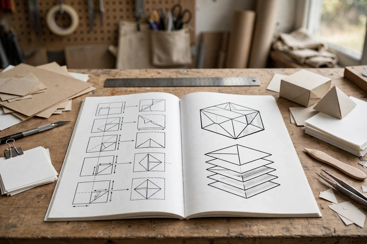
Every image in a print manual must survive reproduction. Photographs need sufficient resolution, roughly 300 dots per inch at the printed size, which means a photo that will print four inches wide needs to be about 1200 pixels across. Line drawings and diagrams should be vector artwork or very high resolution raster, because thin lines turn to mush at low resolution. Design diagrams to work in grayscale even if the book prints in color, since many readers will photocopy pages for the shop. Label parts directly on diagrams with leader lines rather than burying the information in captions, and keep labels large enough to read at arm's length. Photograph processes from the operator's point of view where possible: the reader wants to see what their own hands should see, not an artistic angle. Before finalizing, print test pages at actual size on an ordinary printer; what looks crisp on screen often disappoints on paper.
Page geometry and production specs
Choose a page size that suits bench use: a manual that will not stay open or cannot survive shop conditions fails at its job. Generous margins give thumbs a place to hold without covering text, and they provide room for binding. Set type at a size readable in poor light, with line spacing that does not crowd. If the book will be perfect-bound, keep critical content away from the gutter; if spiral-bound, it can lie flat, which readers love. Plan for bleed on any image or color block that runs to the page edge, and embed all fonts in the final PDF so the printer's system cannot substitute them. Discuss paper stock with your printer early: a manual benefits from a sturdy, slightly matte stock that resists glare under shop lights and survives handling.
Front matter, back matter, and revision control
A proper manual opens with a table of contents detailed enough to find any procedure, and it closes with an index, because readers remember terms, not chapter titles. Include a conventions page explaining your symbols, units, and abbreviations; makers work across measurement systems, so state yours explicitly and be consistent. Version your manual: put an edition or revision date on the copyright page and keep a change log, because procedures get corrected and improved, and readers with older printings need to know what changed. If the manual accompanies a product, align revision numbers with the product so support conversations stay sane. A manual is a living document that happens to be printed; structure it so the next edition is an update, not a rewrite.
A well-structured print manual disappears into the work: the reader stops noticing the book and notices only the project coming together. That invisibility is the highest compliment the structure can earn, and it comes from hundreds of small decisions made with the workbench in mind.
Related Guides
- Typesetting Multi-Column Technical Handbooks for Print: A technical handbook has to be readable, referenceable, and dense with information, three demands that fight each other on the page. Multi-column
- Metacognitive Scaffolding in Open Maker Spaces: An open maker space gives people tools, materials, and freedom. What it does not automatically give them is the ability to think about their own
- Progressive Problem-Based Learning in Maker Spaces: Hand a beginner a lathe and a set of plans and you get anxiety. Hand them a broken thing and ask them to figure out how to fix it, and you get
- Digital Asset Imposition for Print Shop Production: Imposition is the quiet engineering behind every printed book, booklet, and multi-page document: the arrangement of pages on the press sheet so that
- Kinesthetic Learning Feedback in Shop Tool Mastery: Reading about a hand plane teaches you what a hand plane is; pushing one teaches you what sharp feels like. Tool mastery in the shop is kinesthetic