
A technical handbook has to be readable, referenceable, and dense with information, three demands that fight each other on the page. Multi-column typesetting resolves the tension: narrower columns read faster, fit more diagrams alongside text, and let the reader scan like a reference work rather than plow like a novel. Doing it well is a craft of its own.
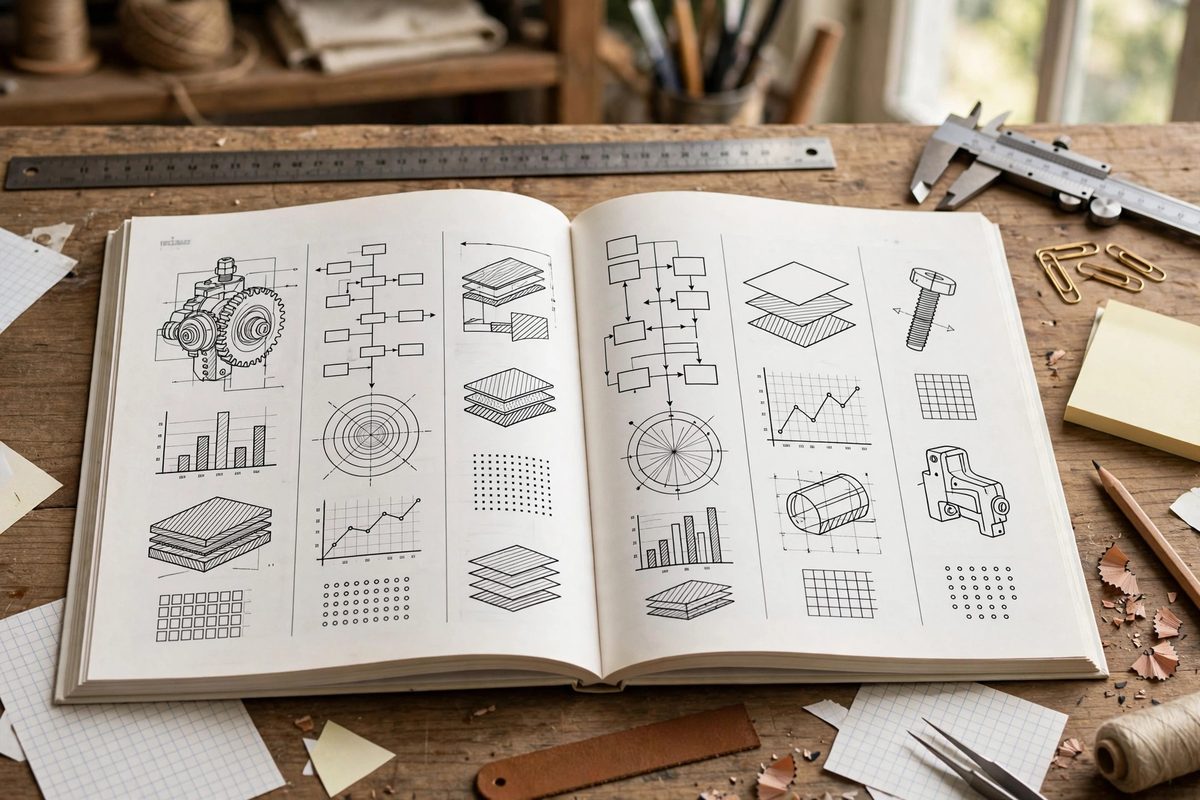
Why multiple columns for technical content
Long lines tire the eye; the reader loses their place returning from the end of one line to the start of the next. Columns of forty to sixty characters per line hit the comfortable reading measure, and on a handbook page that usually means two columns. Technical content benefits further: procedures can run in one column with diagrams or warnings in the other, tables fit naturally, and the page gains a reference-work rhythm. The column structure signals "look things up here" rather than "read me straight through."
Choosing the grid
Start with the page size and work inward: margins generous enough for thumbs and binding, then the live area divided into columns with gutters between them. Two columns suit most handbooks; three work for small formats or highly tabular content. The gutter must be wide enough that the eye never confuses the columns, typically at least as wide as the inter-word spacing is tall. Keep the grid consistent through the whole book; a handbook that changes its column structure chapter to chapter feels chaotic and untrustworthy.
Balancing the columns
Nothing looks more amateur than a page where one column runs long and the other sits half empty. Balance columns by adjusting figure placement, breaking procedures at sensible points, and using the occasional span: a heading, table, or diagram that crosses both columns resets the flow. End-of-chapter pages need special attention, since the text simply stops; a short final column is fine, but a single orphaned line in the second column looks like a mistake. Plan the breaks, do not just accept them.
Figures, tables, and code in columns
Technical handbooks are full of non-text elements, and each needs a column strategy. Narrow figures sit within a column; wide ones span both. Tables that fit a column stay in it; wide tables span or turn sideways. Number every figure and table and reference them from the text, because in a multi-column layout the reader cannot rely on "the diagram above." Keep figures near their references; a diagram three pages from its explanation is a diagram wasted.
Type choices for dense pages
Dense pages need highly legible type. Choose a text face designed for small sizes, with a generous x-height and open counters; set it with enough leading that the lines do not crowd. Use a clear hierarchy: chapter titles, section heads, and body text must be instantly distinguishable, because handbook readers navigate by headings. Reserve bold and italic for emphasis and terms, not decoration. In a multi-column layout, the type does the wayfinding; make it do the job well.
Proofing the printed page
Proof on paper, at actual size, before committing to print. Screen proofs lie about column balance, figure placement, and type legibility; the printed page tells the truth. Check every spread for widows, orphans, and bad breaks; check that spanning elements actually span; check that page numbers and running heads are correct. A handbook is a tool, and a tool with defects in its manufacture undermines confidence in its content.
Grid the page deliberately, balance every spread, place figures with intention, choose legible type, and proof on paper. The handbook will read fast, reference easily, and look like the professional tool it is.
Related Guides
- Structuring Technical Maker Manuals for Print Delivery: A technical maker manual has to do something most books never attempt: teach hands-on skills through paper alone, in an order the reader can follow
- Digital Asset Imposition for Print Shop Production: Imposition is the quiet engineering behind every printed book, booklet, and multi-page document: the arrangement of pages on the press sheet so that
- Pagination Imposition for Multi-Page Workshop Guides: A workshop guide that reads perfectly on screen can become a confusing mess when printed and bound, because print imposes a physical order on pages
- Pagination and Bleed Setup for Multi-Page Workshop PDF: When your workshop manual, build log, or cut-list guide needs to live as a PDF, how you set up the pages matters as much as what you write
- Kinesthetic Learning Feedback in Shop Tool Mastery: Reading about a hand plane teaches you what a hand plane is; pushing one teaches you what sharp feels like. Tool mastery in the shop is kinesthetic