
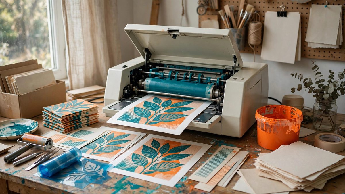
Risograph printing, the soy-based-ink duplicator beloved of zine makers, prints one color at a time from stencil masters, which makes it a natural fit for duotone: two ink colors building rich images from limited means. For tool booklets, shop manuals, and maker zines, duotone Riso hits a sweet spot: the illustrations gain depth and emphasis beyond single-color, while the production stays cheap, fast, and hands-on. The craft is in the separations: deciding what each of the two colors carries, and preparing the artwork so the printed result looks intentional rather than accidental.
Why Duotone Suits Tool Documentation
Tool booklets need clarity first and beauty second, and duotone serves both. One color, typically black or a dark ink, carries the linework: the tool outlines, the dimensions, the text. The second color carries emphasis and depth: highlighting the moving part, shading the cutaway, coding the warning callouts. This division mirrors how technical illustration already thinks, line plus emphasis, so the separation feels natural rather than decorative. Compared to full-color printing, duotone is dramatically cheaper and faster on Riso, and compared to single-color, it transforms the booklet's readability: the reader's eye goes where the second color points. The limitation of two colors is also a design discipline: every use of the second color must earn its place, which produces cleaner layouts than unlimited color ever does.
Planning the Separations
Separation planning happens before drawing, not after. Decide the ink colors first, because the palette shapes every subsequent choice: a dark ink plus a bright accent behaves differently from two muted inks. Then assign roles: the dark ink typically carries all fine detail, text, and outlines, because Riso's resolution and registration favor putting critical information in one pass. The second ink carries fills, tints, highlights, and emphasis graphics. Draw with the separation in mind: keep the second color's elements simple and bold, since fine second-color detail risks misregistration, the slight misalignment between the two print passes that is characteristic of Riso. Embrace misregistration as an aesthetic rather than fighting it: designs with generous trapping, where the second color overlaps the first slightly, look intentional, while designs demanding perfect alignment look broken. The booklet's visual language should be built for the process, not in spite of it.
Preparing Artwork for Two Drums
Each color needs its own master, which means the artwork must be separated into two single-color images. Work in layers: one layer per ink, drawn or placed separately, so the separation is structural rather than extracted afterward. Think in terms of ink coverage per layer: Riso inks are translucent, so overlapping the two colors produces a third color where they intersect, which is a feature to design with, not an accident to avoid. Use halftone or grain textures to build tones within each color: a 50% tint of the accent ink over white reads as a light tint, over the dark ink reads as a rich third tone. Keep large solid areas in mind: heavy ink coverage can cause offsetting and show-through on light paper, so break up big solids with texture or reduce their density. Export each layer as a clean black-and-white image at the printer's preferred resolution; the Riso driver handles the rest.
Paper and Ink Interaction
Riso inks sit on the paper rather than soaking in like toner, which gives the characteristic slightly raised, vibrant print, but it also means paper choice affects the result strongly. Uncoated, slightly textured papers take Riso ink beautifully and suit the zine aesthetic; coated papers can cause smudging and poor drying. Paper color is part of the palette: printing duotone on cream or colored stock adds an effective third tone for free, since the paper shows through the translucent inks. Test the ink-paper combination before the full run: print a test sheet with both colors, including overlaps and tints, and check drying time, because Riso prints need time between the two passes and before handling. Porous papers dry faster; heavy coverage dries slower. The booklet's production schedule must include this drying time or the second pass smears the first.
Imposition and the Booklet Format
Booklets impose pages in signatures, and Riso's print-then-collate workflow rewards planning. Lay out the booklet with the page count as a multiple of four for saddle-stitching, and consider which spreads benefit most from the second color: the cover, the key instructional diagrams, the safety pages. Running the entire booklet in duotone is simplest operationally, both drums run for every sheet, but selective duotone, some sheets single-color, saves ink and time if the content supports it. Keep registration expectations honest across the run: Riso registration drifts slightly over long runs, so designs should tolerate a millimeter or so of wander. Number the masters and keep them: Riso masters can be reused for reprints, which makes the booklet a living document that can be revised and reprinted cheaply as the shop's knowledge evolves.
Duotone Riso gives tool booklets the clarity of two purposeful colors at the cost and speed of the duplicator: dark ink for the linework, accent ink for emphasis, separations planned from the first sketch, and paper chosen as part of the palette. The result looks like nothing else, which is exactly why it suits maker publishing.
Related Guides
- Micro Publishing Formats for Workshop Tool Zines: A zine about workshop tools, a stapled booklet of jigs, techniques, and shop wisdom, is micro-publishing at its most direct: no publisher, no
- Screen Printing Low-Cost Workshop Pamphlets on Newsprint: Workshop pamphlets, the quick guides, safety sheets, and project handouts of a maker space, do not need to look expensive. They need to exist, in
- Accordion Fold Pamphlet Imposition for Shop Primers: The accordion fold pamphlet, a single sheet folded into a zigzag of panels, is the perfect format for a shop primer: cheap to produce, easy to hand
- Pocket Workshop Primers Using French Fold Impositions: A pocket workshop primer is a small printed guide that lives in an apron pocket or a toolbox: feed charts, tap drill sizes, safety checklists, the